Interactive Plotter#
In this tutorial, we will walk through the features of the interactive plotter offered by dysh. There are two types of interactive plots: waterfall/spectrogram plots, and 1-dimensional spectrum plots.
ScanBlock Waterfall plots#
In this section, we describe how to create and interact with waterfall plots. First, we download data from an HI survey and open it with dysh.
from dysh.fits.gbtfitsload import GBTFITSLoad
from dysh.util.files import dysh_data
filename = dysh_data(example="rfi-L/data/AGBT17A_404_01.raw.vegas/AGBT17A_404_01.raw.vegas.A.fits")
sdfits = GBTFITSLoad(filename)
Now, we grab a position-switched scan with GPS interference but we don’t time average it, leaving it as a full ScanBlock with one PSScan.
Waterfall plots can be created using a single ScanBase object or ScanBlock objects that contain many scans.
The process is identical.
ps = sdfits.getps(scan=19, plnum=0, fdnum=0, ifnum=0)
psplt = ps.plot()
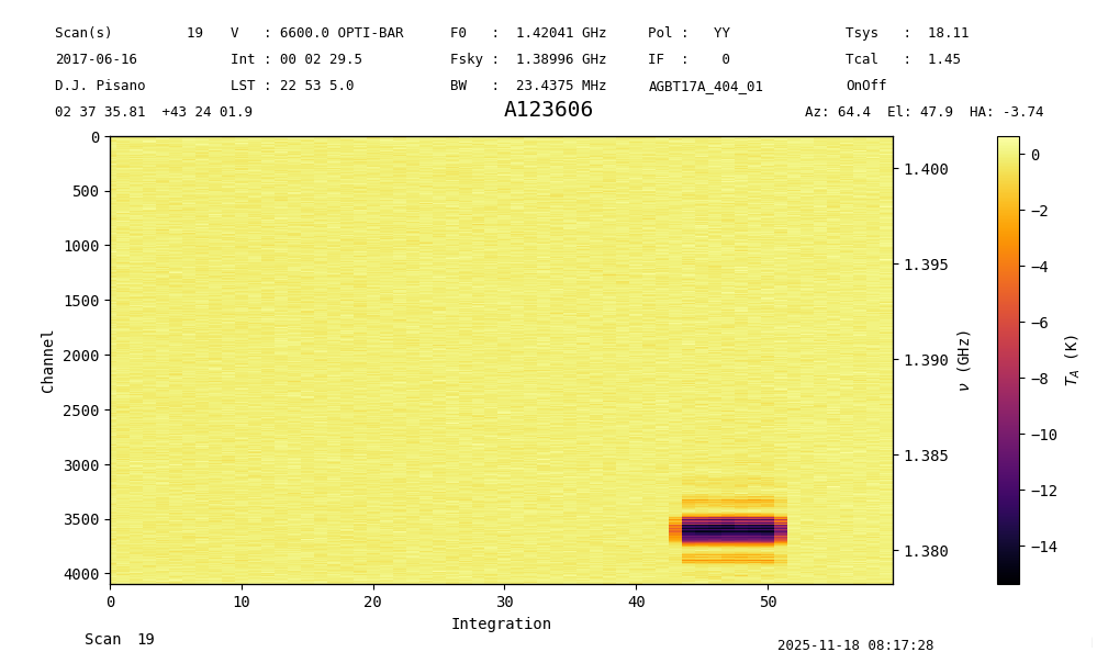
The return is a ScanPlot object.
Since we keep a reference to the ScanPlot object psplt, we can do several things to change its aspects.
Let’s change the lower limit of the color scale to see the clean data and the extent of the GPS RFI a little better.
psplt.set_clim(vmin=-2)
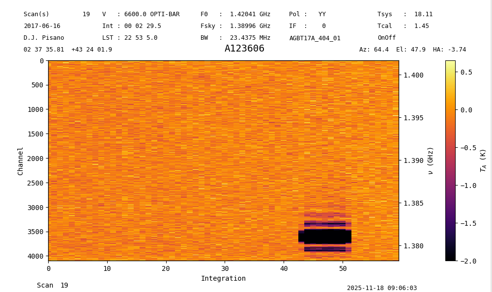
Other functions include set_interpolation, set_cmap, and set_norm.
All of the arguments associated with these functions can be added to the initial plot instantiation as well.
See the matplotlib documentation for more details on these arguments.
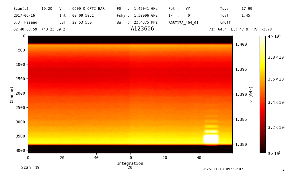
You can also do waterfall plots of a ScanBlock with more than one scan.
tp = sdfits.gettp(scan=[19,20], plnum=0, fdnum=0, ifnum=0)
tpplt = tp.plot(interpolation='gaussian', cmap='hot', norm='log', vmin=3e8, vmax=4e8)
Here we see clearly that the GPS RFI turns on towards the end of the second scan. The X-axis denotes the scan number on the bottom, and the integration number along the tick marks. The integration number resets to 0 at the beginning of each scan.
Spectrum plots#
Now we turn our attention to spectrum plots. As before, we grab some data to illustrate the functionality.
from dysh.fits.gbtfitsload import GBTFITSLoad
from dysh.util.files import dysh_data
filename = dysh_data(example="rfi-L/data/AGBT17A_404_01.raw.vegas/AGBT17A_404_01.raw.vegas.A.fits")
sdfits = GBTFITSLoad(filename)
Now grab a position-switched scan with GPS interference and time average it to get a Spectrum.
Start the interactive plotter with the plot function.
The return of this function is a SpectrumPlot object, which can be used to modify the plot.
Spectrum.plot supports a subset of the arguments offered by matplotlib.pyplot.plot.
These are: xmin, xmax, ymin, ymax, xlabel, ylabel, xaxis_unit, yaxis_unit, label, alpha, figsize, grid, linewidth, color, and title.
If you do not wish to have the interactive plotter and prefer a static plot, add interactive=False to the arguments.
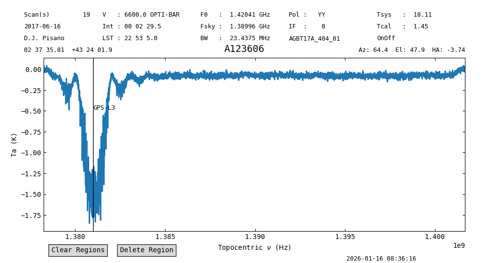
ps = sdfits.getps(scan=19, plnum=0, fdnum=0, ifnum=0).timeaverage()
ps_plot = ps.plot()
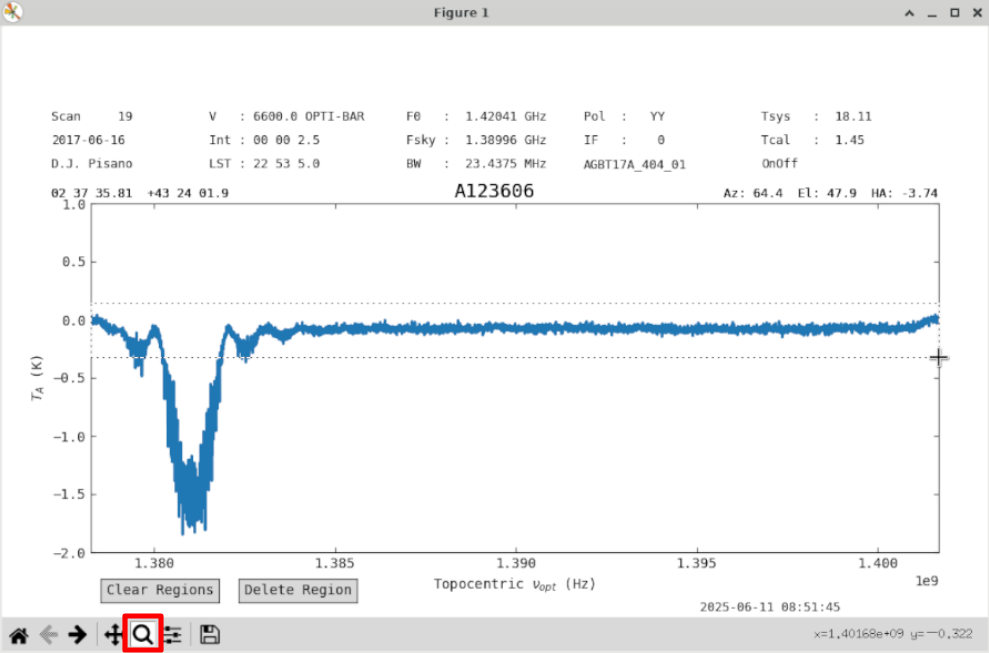
Use the zoom button (red) to zoom into the baseline.
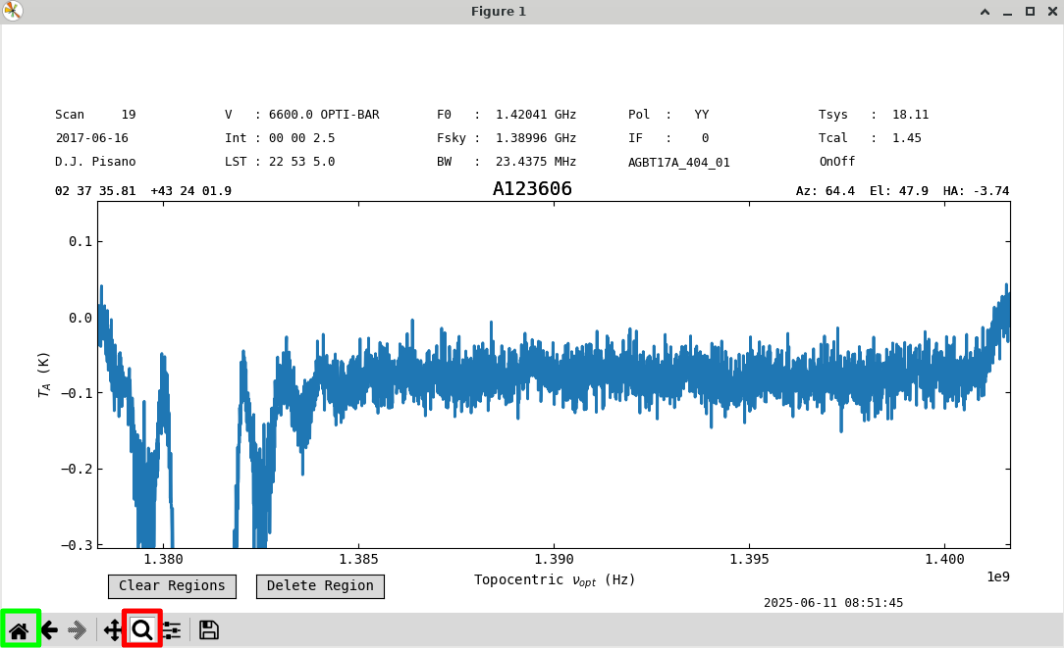
We will use a first order baseline. Uncheck the zoom button (red) to re-enable region selection, and go back to the original zoom level with the home button (green).
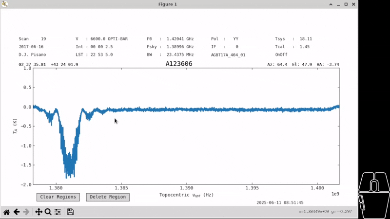
Create a region over the clean part of the spectrum by holding down left-click with your mouse and dragging across the screen.
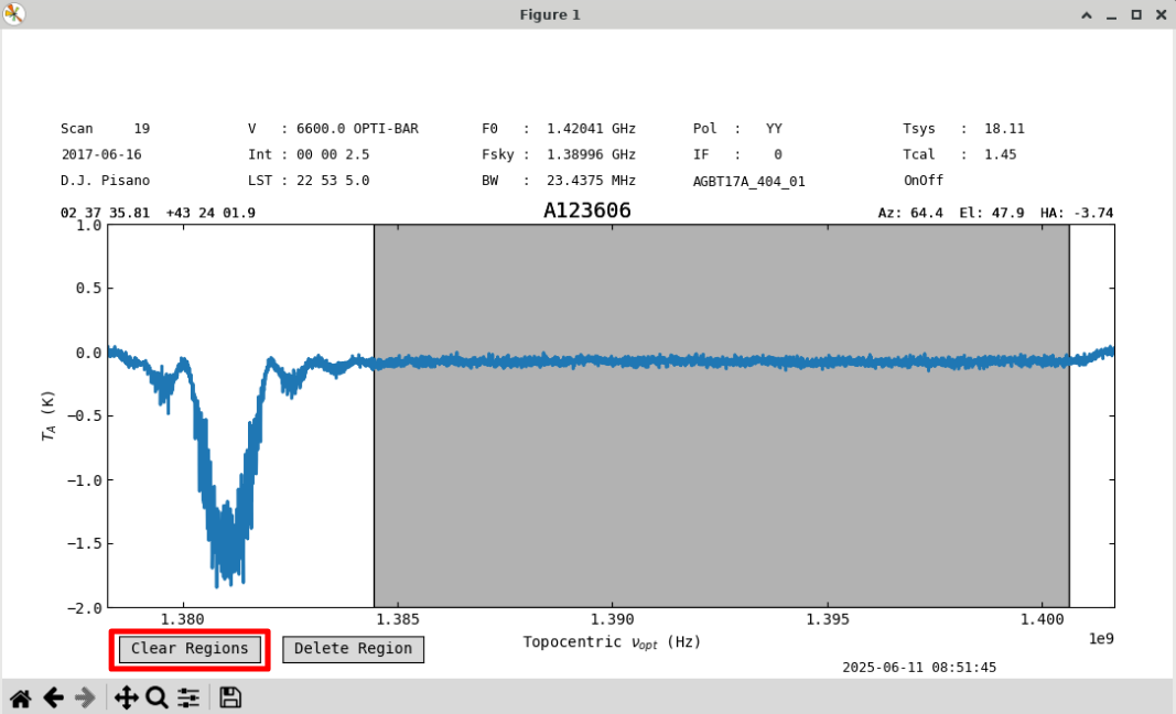
You can clear all regions with the “Clear Regions” (red) button.
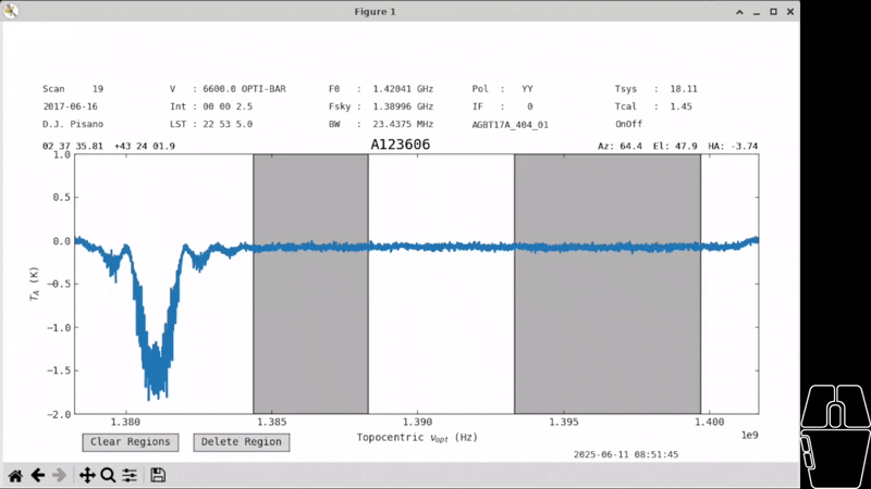
You can click on a region to select it, allowing you to drag it to a different place in the spectrum or change its size. Currently, regions can only be resized by clicking near the edge from within the region. Regions are allowed to overlap. Once a region is selected its borders will turn purple, and you can delete it with the “Delete Region” button.
Note
All buttons on the plot will disappear when using the ps_plot.savefig() command.
However, they will still remain in screenshots.
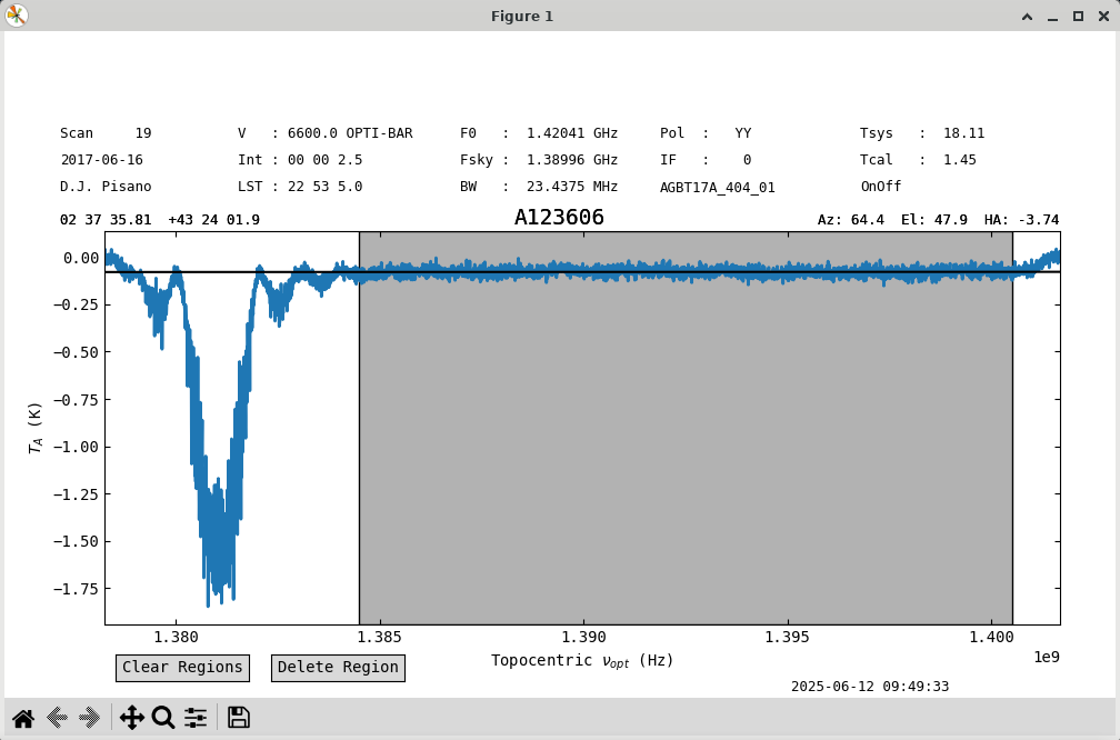
With one large region selected, we can try a baseline.
Use the remove=False option to just plot the baseline fit without removing it.
ps.baseline(1, include=ps.get_selected_regions(), remove=False)
The fit looks good. Let’s subtract it out and save the figure. See that the buttons have disappeared. The white space at the top is reserved for buttons that will be implemented in the future and will be addressed. We can check the stats before and after to see they’ve improved.
ps.get_selected_regions()
[(210,2871)]
print(f"{ps[210:2871].stats()['mean']:.4f}, {ps[210:2871].stats()['rms']:.4f}")
-0.0780 K, 0.0204 K
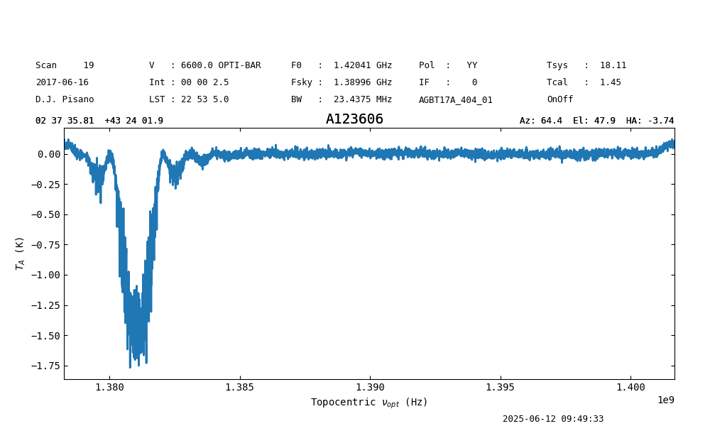
ps.baseline(1,include=ps.get_selected_regions(),remove=True)
print(f"{ps[210:2871].stats()['mean']:.4f}, {ps[210:2871].stats()['rms']:.4f}")
-0.0000 K, 0.0204 K
ps_plot.savefig('my_spectrum.png')
Overplotting#
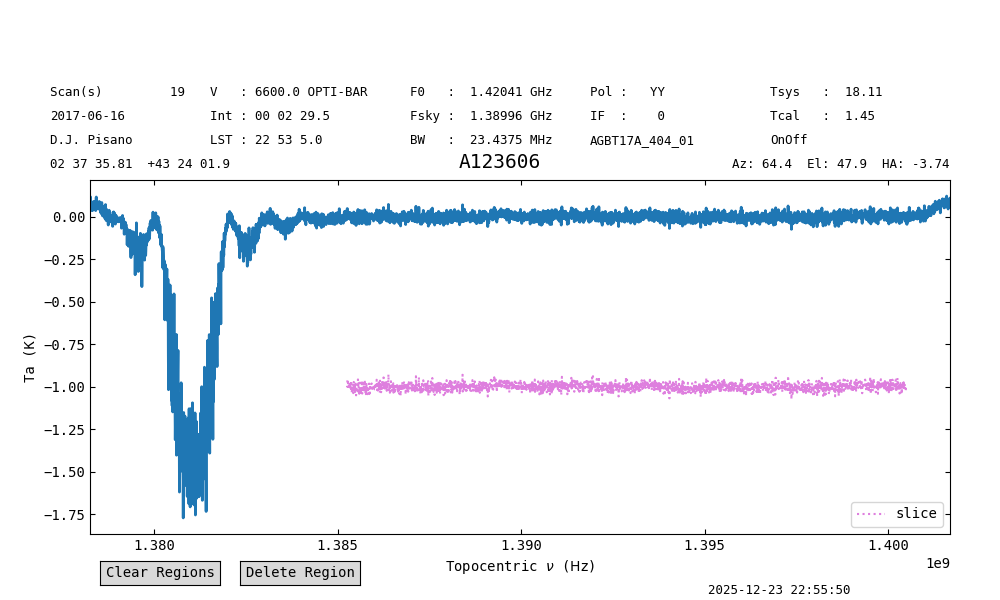
To overplot one or more Spectrum in a plot, use the oshow function.
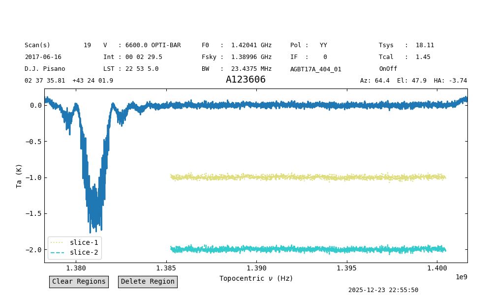
Continuing from the example above, we will overplot a slice of the spectrum.
We select the channels used for the baseline fit, [(210,2871)], and offset the slice so it is clearly visible.
We also give it a label, label="slice", an alpha value of 0.5, a magenta color, color="m", and a dotted line style, linestyle=":".
ps_plot.oshow(ps[210:2871]-1, label="slice", alpha=0.5, color="m", linestyle=":")
To clear the “oshows” use clear_overlays:
ps_plot.clear_overlays(oshows=True)
It is possible to overplot multiple spectra in a single call. In this case, the arguments must be lists, with one value per spectrum being plotted. For example:
ps_plot.oshow([ps[210:2871]-1,
               ps[210:2871]-2],
              label=["slice-1", "slice-2"],
              alpha=[0.5, 0.8],
              color=["y", "c"],
              linestyle=[":", "--"])
The same result can be obtained by directly using the oshow and oshow_kwargs in the call to plot:
ps_plot2 = ps.plot(oshow=[ps[210:2871]-1,
                          ps[210:2871]-2],
                   oshow_kwargs={"label":["slice-1", "slice-2"],
                                 "alpha": [0.5, 0.8],
                                 "color": ["y", "c"],
                                 "linestyle": [":", "--"]}
                  )
Overlaying Catalog Lines#
You can overlay the molecular spectral lines found from the spectral line search feature on your plot with the following command:
ps_plot.show_catalog_lines()
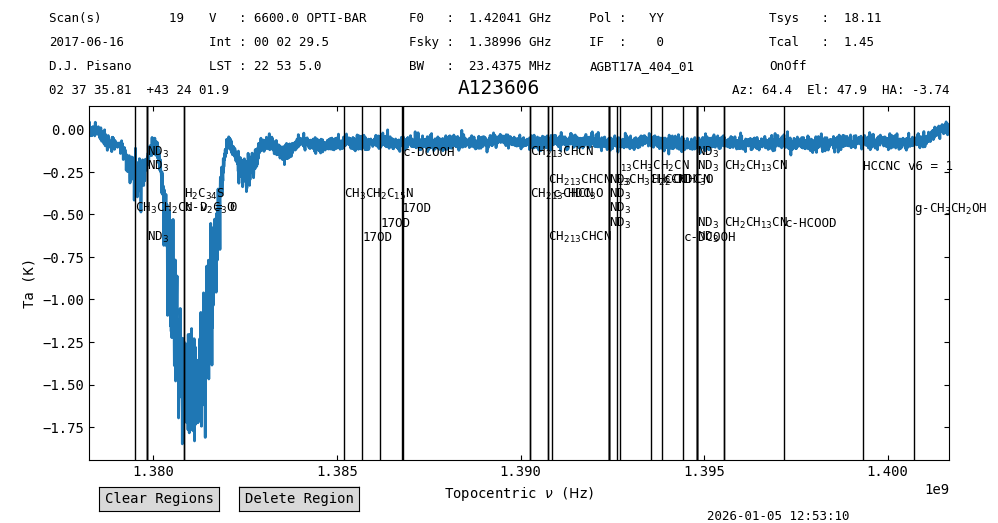
You can add kwargs that pass to dysh.line.SpectralLineSearchClass.query_lines,
such as chemical_name and intensity_lower_limit. However, the minimum and maximum frequencies are taken from the underlying spectrum.
Just like any other overlays, you can clear these with:
ps_plot.clear_overlays()
You can also add your own custom vline with annotate_vline to denote a single spectral line, or just anything of interest on the plot.
ps_plot.annotate_vline(1.381e9, 'GPS-L3')